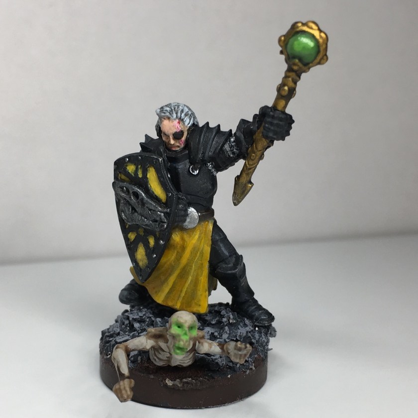
I held off painting this figure for a while, as it’s one of the rarer ones in the Chainmail line. The shield, in particular, is superb and is easily plundered for kit-bashing. I have another one of these figures without a shield that I’ll find something to do with, I’m sure.

The pose is great. Among the best in the game. The figure suffers from none of the flatness that is typical for Chainmail. There is a lot of subtle detail in the face that rewards careful painting.

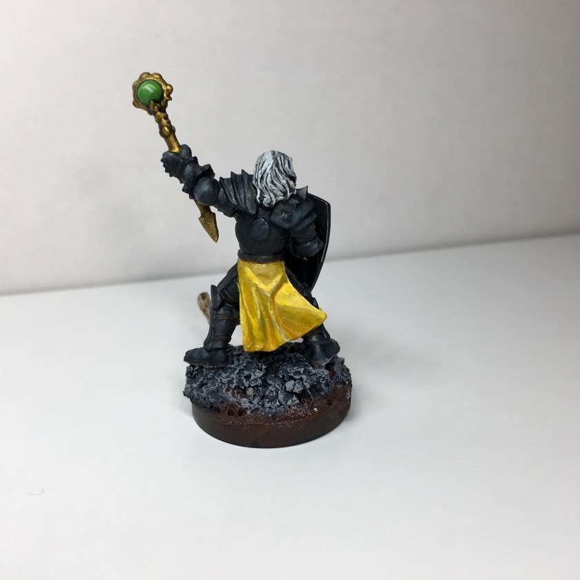
My shading on the loincloth is not the best here. I could have used another couple of transitional shades. As before, I got the vivid yellow by shading in cream tones and then glazing with a yellow ink.
I wanted a matte black effect on the armor, so I went with a non-metallic paint and did some non-metallic metal effects in the highlighted areas. My first pass was way too detailed and wound up distracting from the whole. I repainted and put in some very abrupt transitions on edges and curves. I’m pretty happy with the result, though, as always, my lines could be cleaner.

The shield is much rougher than I’d like. Yellow is difficult to work with and every black smudge took multiple layers of yellow to clean up, leading to yellow smudges and an endless cycle of mediocrity. This is kind of detail work is definitely where I struggle the most. The emblem on the shield is a Vallejo gunmetal gray. I really like the texture contrast there.
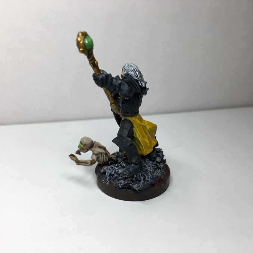
The standouts here are the staff and the base. I went over the jewel with multiple glazes, working up from a marbled light green to successively darker shades of green. I gave the final version and extra coat of glossy lacquer.

For the base, I had a bunch of skulls from a Kickstarter I backed a few months ago. Digging through the box, I came across a skeletal torso and had the great idea of posing the base in the middle of a reanimation. The arms had to be repositioned but the final effect is wonderfully lurid.

Nice! I really like the jewel and it reminds me that I need to find some decent gloss for jewel effects. It’s so rare that I paint gloss these days, but it does come in handy.
Yea, yellow (or white) against black is a real paint. Any little mistake gets amplified. On the lower part of the tabard, I would try a thin wash over the top. I’ve found with lighter colors, like flesh, I like to apply the base color, bright highlight, and maybe the extreme (really bright highlight), and then a wash. That final wash will mute everything a bit and bring the colors more in line. As always, I’m still experimenting with that a bit, but it’s working pretty good so far.
LikeLike